Client presentation
Hōko is a webzine that interviews musicians in France. In 2020, they decided to become a communication agency for musicians while still keeping the blog up.
Client's requirement
The client wanted me to redesign their website to showcase the agency part and also work on their social media presence.
Challenge
The client had no branding in place besides a black and white logo. Therefore I proposed a graphic charter to bring more dynamism to the brand and to help it be more distinctive.
Solution
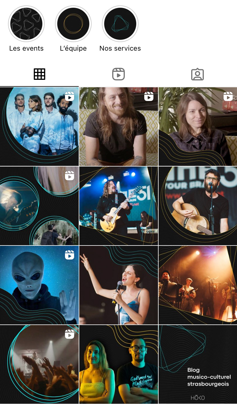
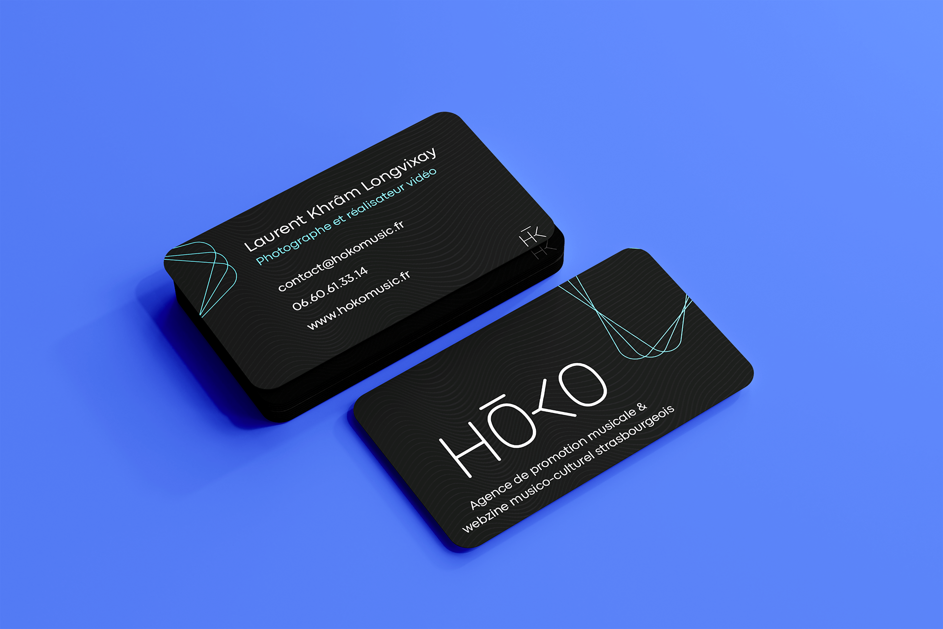
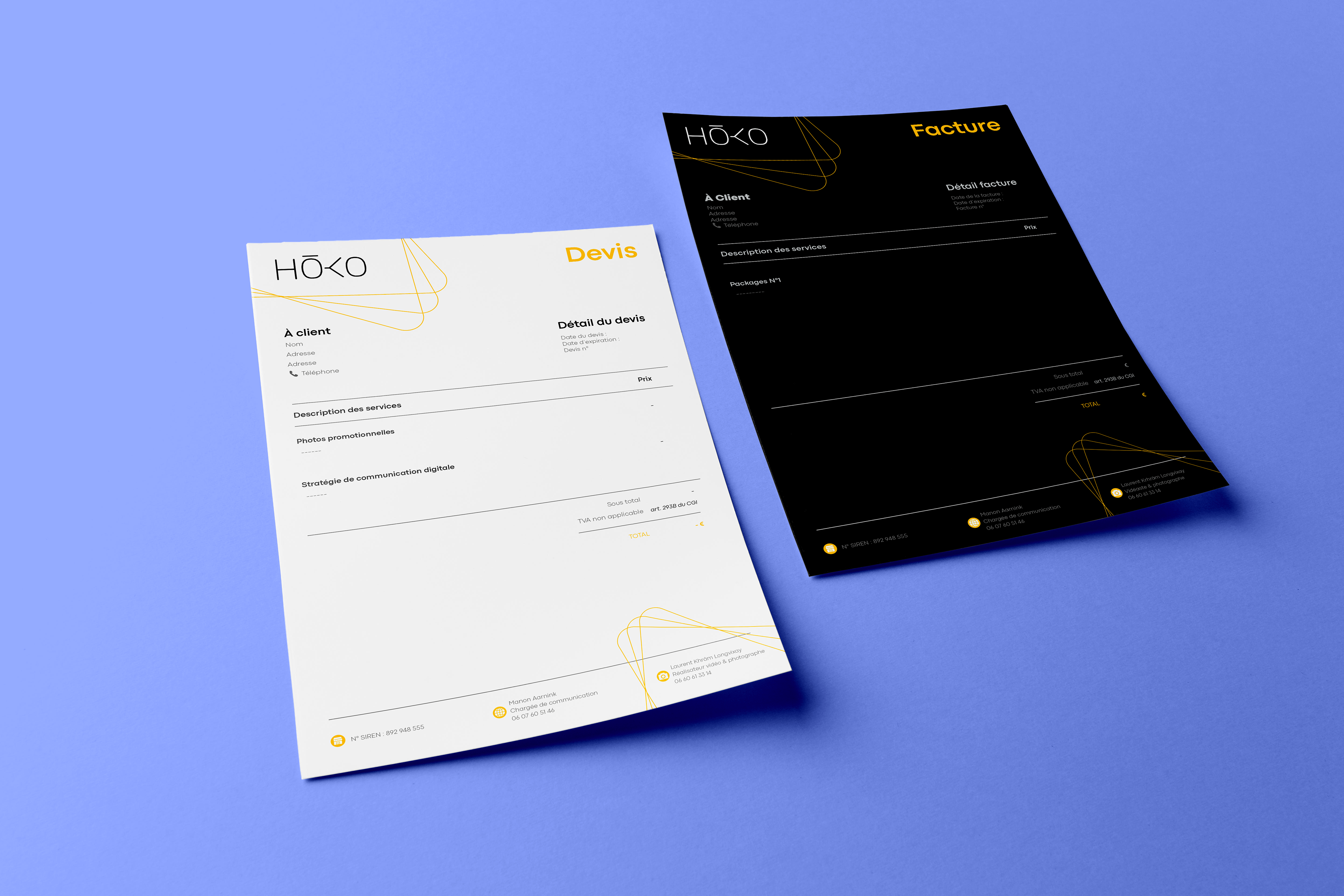
Keeping their original logo, I rounded the edges of each letter and to add punch I added two vibrant colors as their secondary colors : cyan and yellow. For the graphic elements I got inspired by the music industry itself. I redesigned the icon "play" which became the main graphic element, used circles to remind of CD's, and lines to remind of the music frequencies.
I later on transferred the whole branding on all their communication supports : social media, invoices, business cards, etc. I also animated their logo, created videos for their social media and redesigned their entire website.
Skills
Branding : Illustrator, After effect, Photoshop
Social media : Mojo, Illustrator, Premiere pro, Figma, Later
Communication : Indesign & Figma
Website : Wordpress, Elementor, Illustrator
Organisation : Notion

Reels for social media
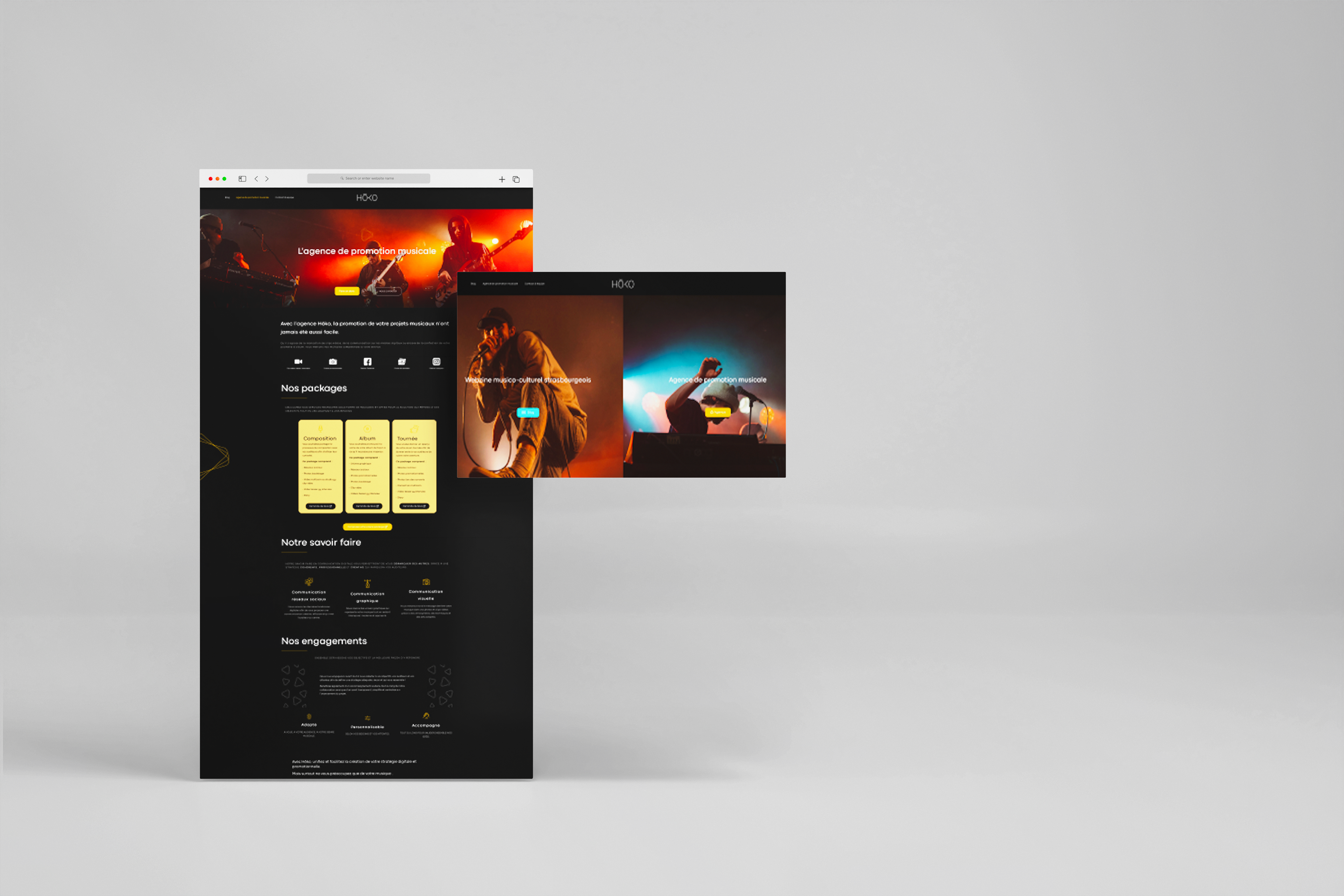
Website