Client presentation
Pauline Meyer is a young orthoptist that started to work independently. Her work is the re-education of a patient's eye which could be due to different conditions.
Client's requirement
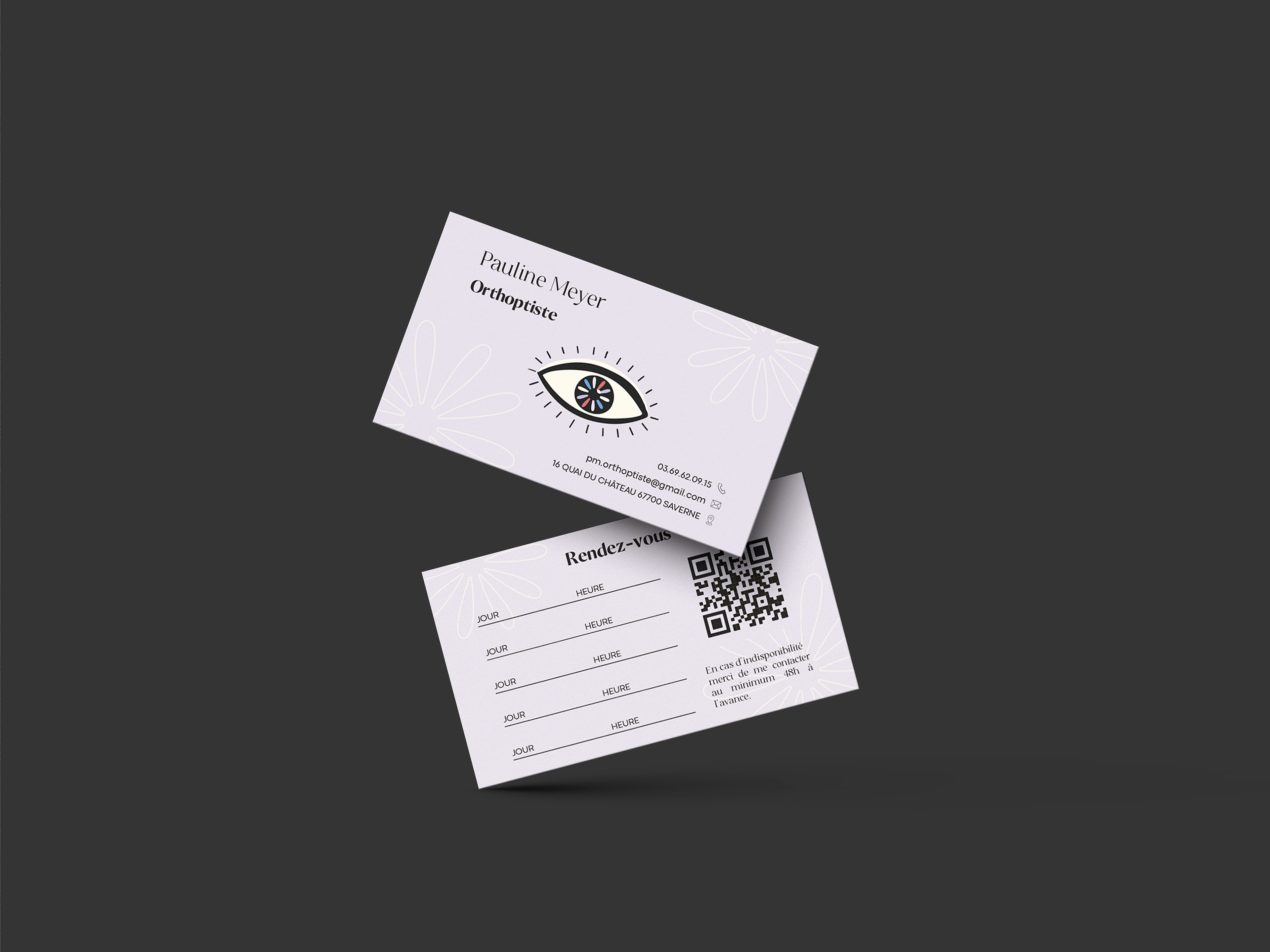
As a young and new practitioner on the market, my client wanted to have a branding that would keep the marks of her profession and field but that would also allow her to differentiate herself. She also wanted business cards where she could write the next appointments for her clients.
Challenge
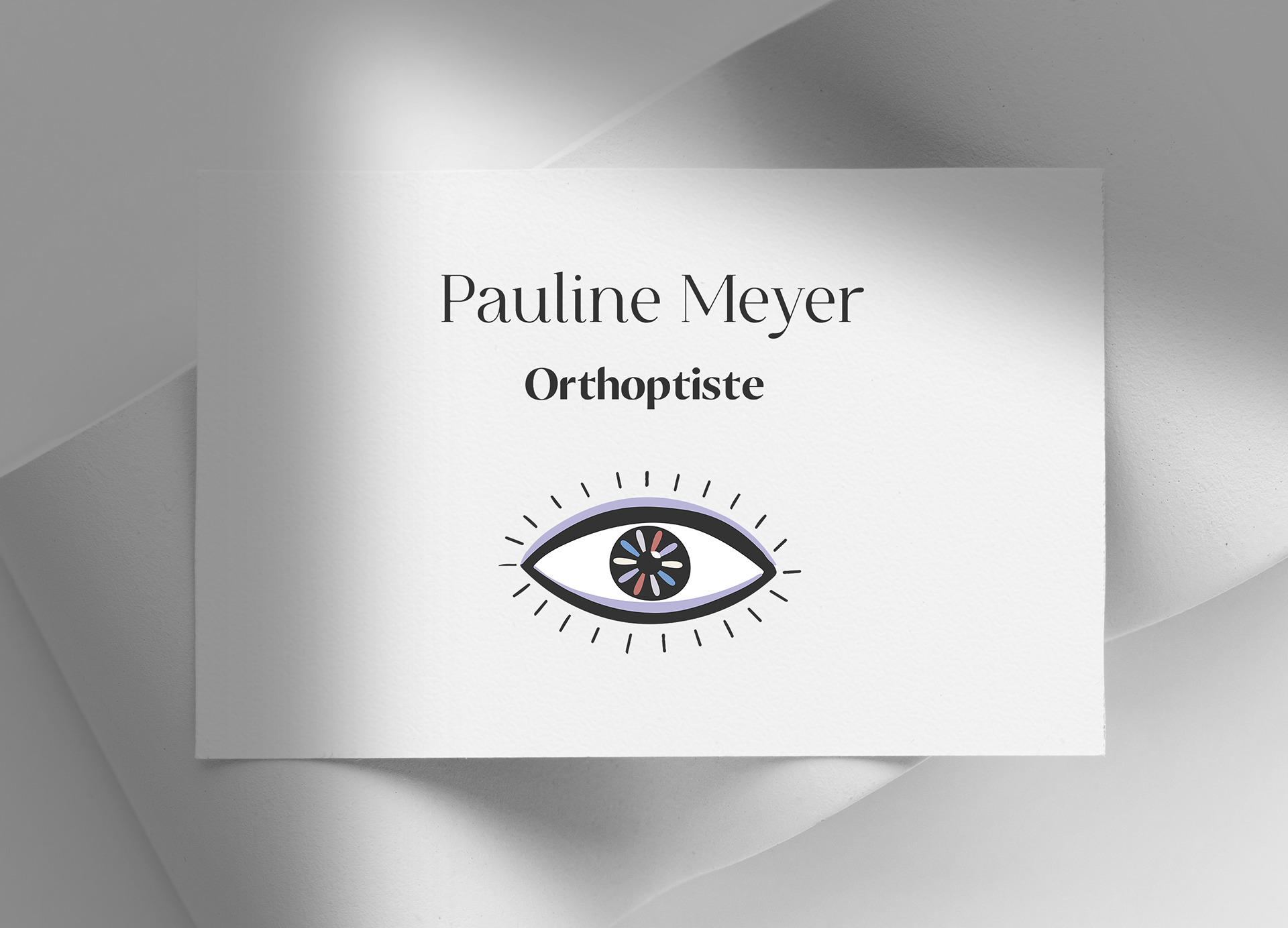
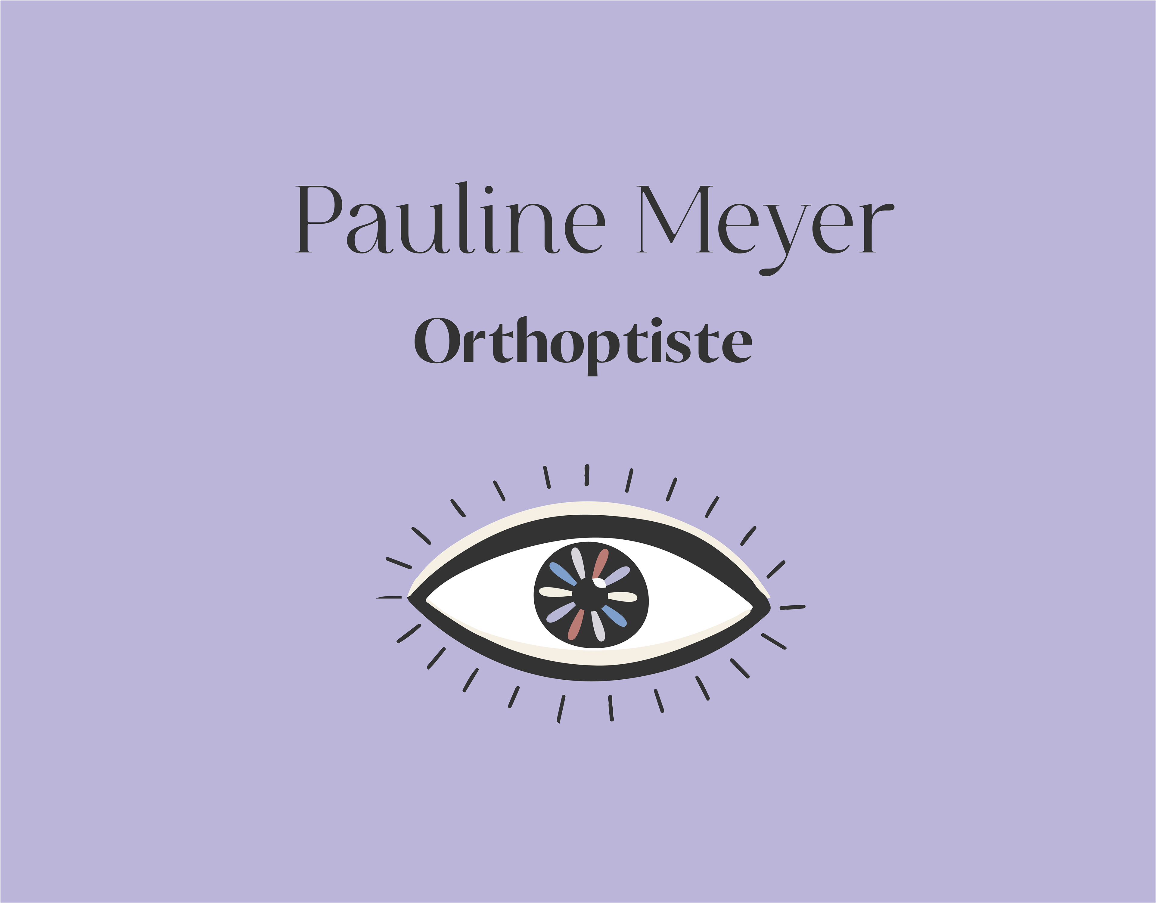
The market is saturated with eye doctors (opticians, orthoptist, etc.) who all have a very similar branding : an eye of some sort and the color blue. As my client wanted to herself have an eye as her logo it was challenging to find a way to make it different.
Solution
To create a unique branding I drew an eye that has an « imperfect » look and added a type of flower in the middle that sends the message of rebirth and beauty. Those elements refer directly to her profession and to the before and after a client can feel when working with Pauline. To keep the branding on the feminine side and to resemble my client I used a variety of pastel colors which she can use on her logo.
Skills
Branding : Illustrator,
Business cards : Indesign